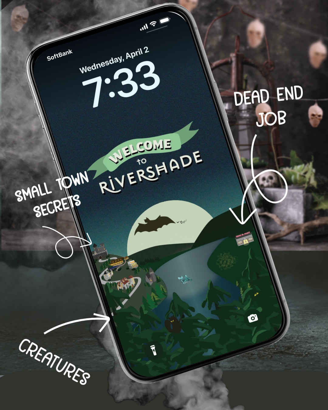
I’m a little nervous about sharing this sneak peek of art for Rivershade. You know how you want everyone to love your project baby as much as you do? Totally going through that here.
As much as I enjoy writing the story of Rivershade, I’m having so much fun discovering another side of story through the art I’m making for the Patreon members of the Rivershade Resident tier.
Ukiyoe and Golden Age of Travel posters: a shallow dive down the rabbit hole
My main inspirations for the illustrated Rivershade art are ukiyoe and vintage travel posters from the 1900s to 1960s often called the golden age of travel posters.
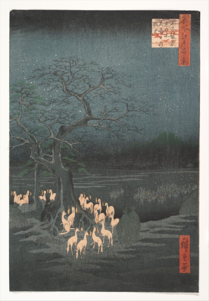
Ukiyoe is a type of woodblock print which found its audience during the Edo period of Japan. It depicted the pop culture of its time. You can read more about Ukiyoe at this blog post. But the connections between this art and ukiyoe are:
- flattened perspective
- color and shading
- simplified forms and stylization
Image courtesy of The Met‘s Open Access collection. Credit: Rogers Fund, 1925. Image Source
Stylistic lineage
Ukiyoe influenced Art Nouveau artists and the Japonisme style in the west. This inspiration continued into the Golden Age of Travel posters where you can see the above elements in the image styles.
Golden Age of Travel Posters refers to travel posters from the 1920s to 1960s. These illustrations combined different stylistic influences such as Art Deco, Art Nouveau and later Mid-Century Modernism.
They also include National Parks tourism created by the WPA (Works Progress Administration) in the 1930s. New Zealand’s MOTAT (Museum of Transport and Technology) has an amazing collection of New Zealand posters in a collection called: Best Reached by Rail. You can also explore more examples of these images on my Golden Age of Travel Pinterest board. You can find a great collection of U.S. National Parks or travel in Europe at Vintagraph which has a great collection (not affiliated, just like the site).
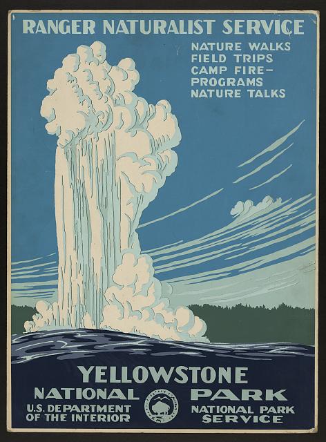
Powell, C. Don , Designer. Yellowstone National Park, Ranger Naturalist Service. [Washington, D.C.: Department of the Interior, National Park Service] Photograph. Retrieved from the Library of Congress, <www.loc.gov/item/2007676133/>. No known restrictions on publication
These posters were often lithographs or silkscreens instead of woodblocks used to print Ukiyoe. These processes gives the travel posters a specific texture—a little bit of grain. They didn’t aspire to be photographs. The illustrators used bold typography and relatively clean lines, sometimes simple palettes. These images celebrated natural wonders or, in art deco style, the technology of modern travel such as faster trains, ships and planes.
Shallow dive into the rabbit hole of art styles
I often know these styles when I see them, but can’t always describe them. So let’s explore. Below is my TLDR of the styles. The links below are for an amazing store called International Posters. I am not an affiliate, but their site has a lot of great information and an amazing collection.
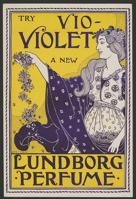
Art Nouveau: 1890s – 1910 (strong influences from Ukiyoe and Japonisme)
Style avatars: Alphonse Mucha (artist), Elves from Lord of the Rings movie
- Flowing, Organic Lines – Curved, whiplash-like forms inspired by nature. I’ve heard it aptly described as “designed by elves.”
- Floral & Natural Motifs – Leaves, flowers, vines, and feminine figures.
- Ornamental Typography – Elegant, decorative lettering that blends with the design.
- Soft, Harmonious Colors – Earthy tones, pastels, and muted golds.
- Asymmetrical Composition – Dynamic, fluid layouts rather than rigid structures.
- Illustrative & Hand-Drawn Style – Detailed, artistic imagery, often featuring idealized women.
- Decorative Borders & Frames – Intricate patterns that unify the design
For above image:
Rhead, Louis, Artist. Try vio-violet a new Lundborg perfume. , None. [United states: publisher not identified, between 1890 and 1900] Photograph. https://www.loc.gov/item/2015646922/.
No known restrictions on publication.
Art Deco: (1920s-1940s)
Style Avatars: Tamara de Lempicka (artist), The Great Gatsby (2013 movie) as a modern interpretation of it, Dwarves from Lord of the Rings movie.
- Bold Geometric Shapes – Sharp angles, zigzags, and streamlined forms.
- Luxurious, Metallic Colors – Gold, silver, deep blues, and rich jewel tones.
- Stylized, Elegant Figures – Elongated, symmetrical, and sophisticated characters.
- Strong Symmetry & Order – Balanced, structured layouts with a sense of grandeur.
- Sleek, Sans-Serif Typography – Blocky, modern fonts often integrated into the design.
- Machine & Speed Influence – Inspired by technology, aviation, and the Jazz Age
- High Contrast & Drama – Striking color combinations and bold highlights/shadows.
Note: I can’t take credit for the elves=Art Nouveau and Dwarves=Art Deco. I’m 99.9% sure that I heard that concept on The Lord of the Rings Extended DVD commentary. I highly recommend finding this if you can.
Mid-Century Modern:
Style avatars: Saul Bass (American movie poster, titles designer) Charley Harper (American artist using simplified, recongizable forms), Dorothy Draper (interior design), and for a contemporary take on the style, Wes Anderson (director).
- Geometric Shapes & Abstract Designs – Clean, sharp lines and simple shapes (circles, triangles, rectangles). Minimalist, balanced compositions.
- Minimalist Typography – Bold, sans-serif fonts (e.g., Futura, Helvetica). Simple, readable, and direct.
- Bold & Contrasting Colors – Vibrant color palette (mustard yellow, turquoise, orange, black, white). High contrast and flat color blocks.
- Flat, Stylized Imagery – Simple, abstract representations of objects or people. Minimal detail, stylized design.
- Dynamic Composition – Use of diagonal lines and asymmetry to create movement. Energetic, optimistic feel.
- Functional Simplicity – Clear, straightforward designs with no excess decoration. Focus: practicality, visual impact.
- Modern Life & Technology – Common topics about technology: space, automobiles, architecture, and consumer goods. Futuristic and optimistic themes.
Ok. Deep Dive OFF!
Back to my design
When it came to creating a design, it felt like the right choice to use these influences for my fictional town.
I have a habit of picking up every tourism brochure when I travel and I love that kind of ephemera. The plan is to expand the Rivershade world through objects. I focused more on the more modern style than Art Nouveau for this poster. But I’m currently making some “product packaging” that reflects some of Rivershade’s Gilded Age origins. But you’ll have to come back later to see it.
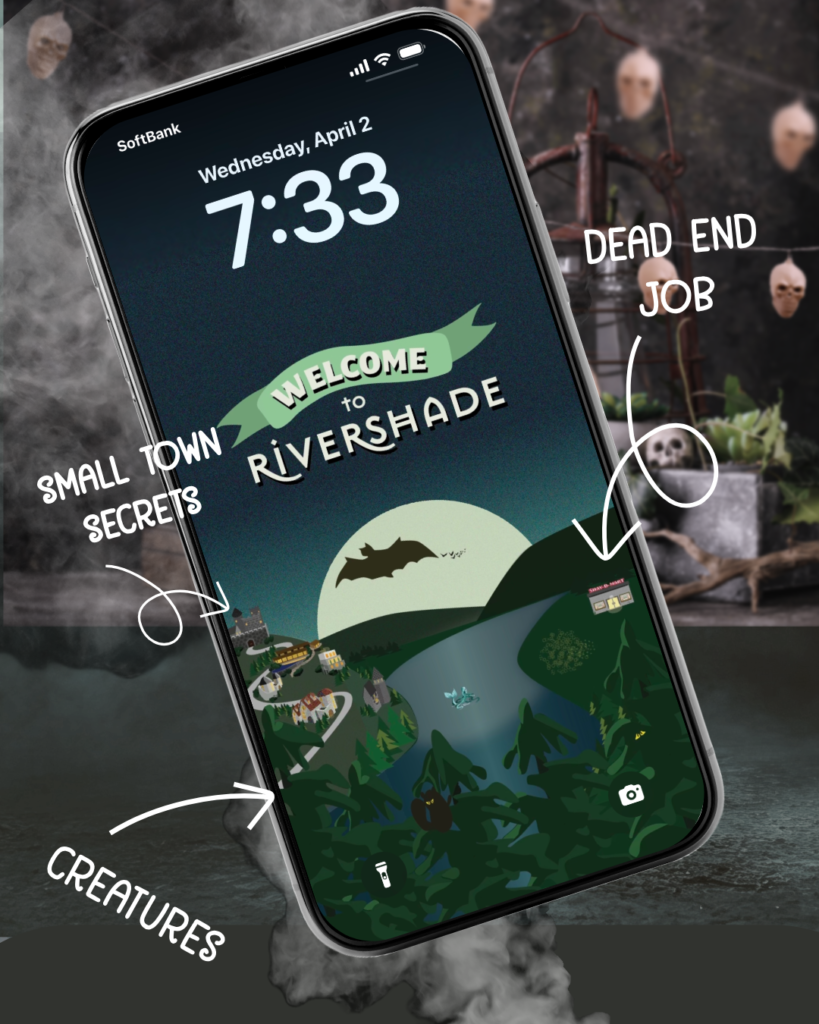
I wanted to create Rivershade artifacts like a travel poster and include parts of the town and story elements: founding families and billionaires’ mountain mansions, Bohdie’s dead-end job at Shay-D-Mart, and some creatures.
Can you spot the Siren and the Squirrelman?
Here’s the lock screen version:
Tier member art bonus
I’ve created two pieces based on this image in jpeg/PDF using Adobe Illustrator:
- smartphone lock screen (seen above in jpeg)
- postcard-size art (PDF)
Get this lock screen and postcard-size version of the art as well as weekly episodes of Season 1 by joining my Rivershade Resident tier on Patreon.
Opinion Time
Do you have a favourite artist or art style? Would you like to see a version of a town tourism brochure?